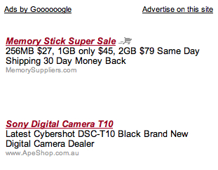
Google Testing a Variety of Ad Formats
There have been reports of Google testing a large variety of different ad formats over the last month or so. I’m sure they are testing these to see which ads get the best click through rates and the best conversion rates. Even though Google is the leader in the online advertising space, it’s good to see them still trying different things to tweak the system. This makes it better for both advertisers ad publishers.
Here is a summary of their recent experiments. I’m sure there are more of them out there too.

New Google Logo tests. Google has been experimenting with different logos on the ads for a while, this is the latest incarnation. From SEO Roundtable

This is a tabbed ad. Lot’s of potential here to do all sorts of interesting things. These kind of remind me of Chitika ads that are tabbed. See more screen shots at Stanley Shilov’s Blog.

This is being called a Horizontal Image ad. Similar Vertical Image Ads have been spotted in the past as well.

AdSense ads where the headline text is in italics have also been spotted. This is a pretty subtle change, but I’m sure Google can pick up even the smallest change in the CTR between ads.
This is also a good lesson for publishers: keep experimenting. If Google is still experimenting with ads after all these years, publishers should be doing the same thing. Try different ad and affiliate programs, try different colors, formats and placements. You can never be sure that you have the best combination for your site.